A very simple SwiftUI keyboard accessory view for iOS 15+ that floats above the keyboard and supplies several useful benefits missing from vanilla SwiftUI:
Fully customizable keyboard toolbar that lets you add the style and content you want without restriction. Use a different toolbar for different controls, etc.
Cancellable input, that allows users to cancel changes to a text field with a single tap.
Consistently dismissable and ensures that there’s always a keyboard dismiss button visible, regardless of keypad type. Tapping outside the keyboard area also dismisses.
Simple to use - just attach the Keyboard Manager to your view hierarchy and use KBTextField in place of TextField.
Modern look and feel that avoids UI shift when the keyboard is loaded or dismissed.
Copy KeyboardManager.swift and KMTextField.swift into your project. Attach an instance of KeyboardManager to your view hierarchy. Use KBTextField in place of SwiftUI's TextField. For example, from ContentView.swift:
struct ContentView: View {
// 1. Create a KeyboardManager, which manages the state
// of our keyboard view system. You only need one.
@StateObject var keyboardManager = KeyboardManager()
// A state var to cache the user's entered text.
@State var text = ""
var body: some View {
VStack {
Spacer()
// 2. Use TextFieldEx in place of TextField.
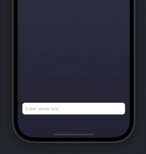
KMTextField(value:$text, placeholder:"Enter some text")
}
.padding()
.padding(.bottom, 30)
.background(LinearGradient(gradient: Gradient(
colors: [Color(red:60/255.0, green:60/255.0, blue:80/255.0),
Color(red:40/255.0, green:40/255.0, blue:60/255.0)]),
startPoint: .top, endPoint: .bottom))
// 3. Hook up the Keyboard Manager, which will swallow our
// ContentView and layer a keyboard accessory view in front
// of it, if one has been set. This will also add our
// KeyboardAccessoryViewManager to the environment.
.withKeyboardManager(keyboardManager:keyboardManager)
}
}
SwiftUI marries the concept of safe area margins with keyboard avoidance. When the keyboard is loaded, the safe area is adjusted (reduced) to accommodate the keyboard. This, in turn, causes the underlying UI to react, and hopefully do the ‘right thing’ depending upon the context.
If the view hierarchy respects the safe area margins (e.g. ignoreSafeArea() is not used), then the UI should generally react to ensure that the active input fields remain visible when the keyboard is visible. If the view hierarchy ignores safe area however, then extra steps are usually required to ensure that input UI remains usable. Keyboard Manager disables keyboard adjustments to the safe area, opting instead to render a preview of the input text in an accessory bar above the keyboard. The underlying UI will not shift as a result of keyboard summons/dismissal, which may not be the desired behavior for all of your text input controls.
